
Color Variables in Squarespace
Understand Squarespace's 5-color palette, section theme variables, and CSS custom properties. Includes examples and a webinar.
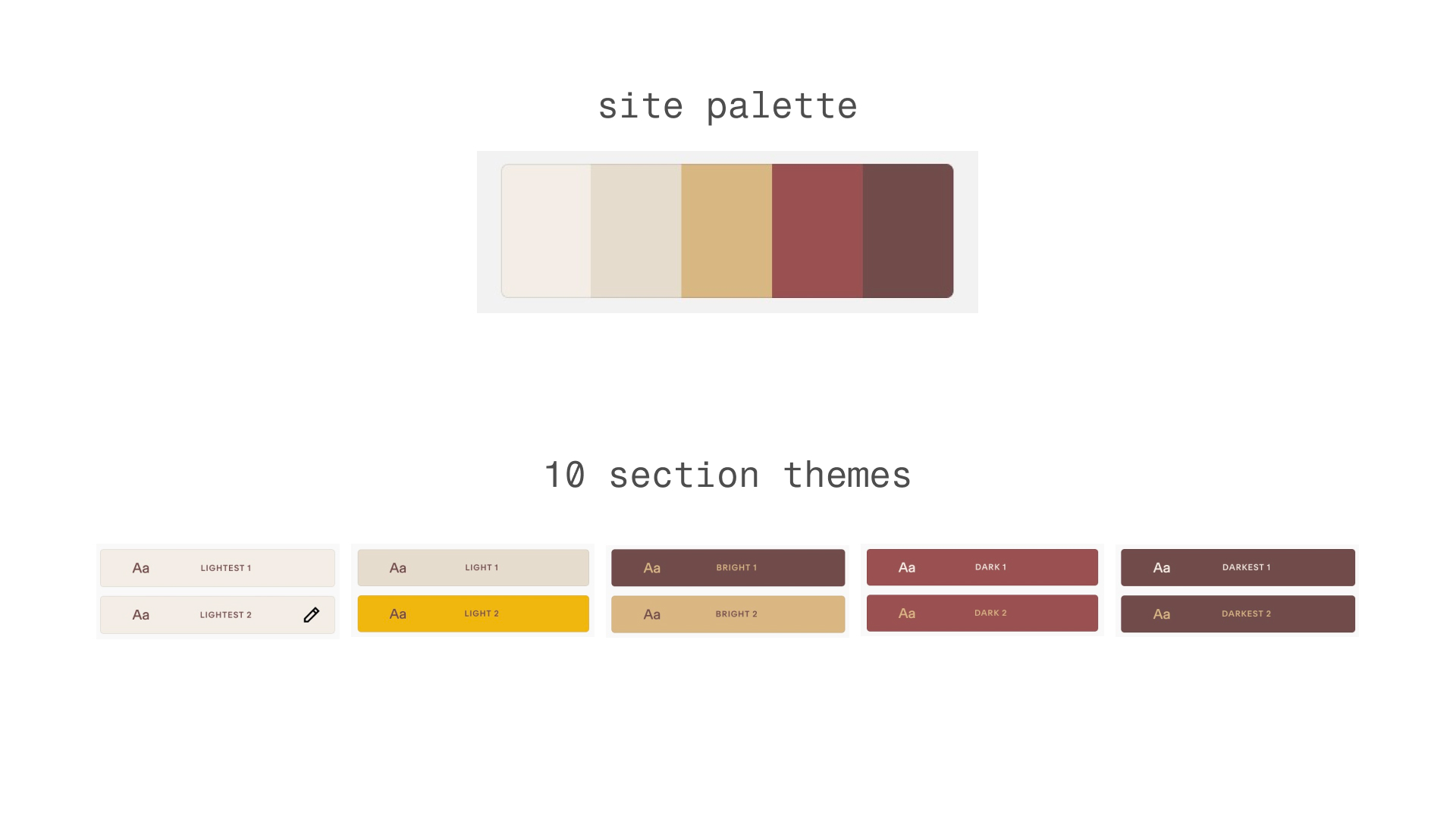
Squarespace's color system is built around a five-color palette. From this palette, Squarespace generates 10 color themes, which are applied to style individual page sections.
Color Palette & Custom Properties
Each color theme defines default styles for hundreds of components and blocks within a section. These values are stored as CSS Custom Properties (often called variables). Using these variables lets you style your site while keeping everything consistent with the selected theme.
Why This Matters
Instead of hard-coding a color — for example, setting a List Section title to blue — you can reference a CSS variable like var(--headingLargeColor). This way, when you or your client change the section's color theme, the styles update automatically without needing to touch your custom CSS.
Colors in the Chrome Extension
You can easily access your site colors in the Toolkit Chrome Extension. Your five site colors are immediately available in hex and hsla formats. You can add and save colors, and browse all color variables available on your site.
I also recorded a webinar on how to use color variables on your site—you can watch it here:
Watch the Webinar →
Site Color Variables
Squarespace automatically adds each color from your site palette as a custom property on the :root element. These are stored as HSL values only (without the hsl() function), so they are not directly usable in CSS.
:root {
--white-hsl: 0, 0%, 94.9%;
--accent-hsl: 290.1, 85.83%, 47.06%;
--lightAccent-hsl: 0, 0%, 80%;
--darkAccent-hsl: 0, 0%, 25.1%;
--black-hsl: 0, 0%, 10.2%;
}
To make them usable, wrap them in hsla() and assign them to your own variables:
:root {
--palette-1: ~'hsla(var(--white-hsl), 1)';
--palette-2: ~'hsla(var(--lightAccent-hsl), 1)';
--palette-3: ~'hsla(var(--accent-hsl), 1)';
--palette-4: ~'hsla(var(--darkAccent-hsl), 1)';
--palette-5: ~'hsla(var(--black-hsl), 1)';
}
Now you can reference your site colors with --palette-1 through --palette-5:
h2 {
color: var(--palette-3);
}
This will set the color of all h2 headings to your accent color.
Section Theme Variables
For a more dynamic approach, use section theme variables. These are automatically generated per color theme and applied as custom properties on each section.
Each of your 10 color themes includes 300+ variables that define how components and blocks are styled. These variables ensure your custom components stay consistent with the active theme.
| Name | Custom Property |
|---|---|
Section Background | var(--siteBackgroundColor) |
H2 Color | var(--headingLargeColor) |
Paragraph Color | var(--paragraphMediumColor) |
Text Block Background Color | var(--tweak-text-block-background-color) |
Heading Color on Background | var(--tweak-heading-large-color-on-background) |
Text Color on Background | var(--tweak-paragraph-medium-color-on-background) |
You can use these variables building a custom template or component while maintaining consistency with the chosen color theme. Here are some of the most common variables you can use.
.my-btn {
background-color: var(--headingLargeColor);
color: var(--backgroundOverlayColor);
}
See All Color Variables